The Curious Case of the Long ſ: When S Looked Like F but Wasn’t

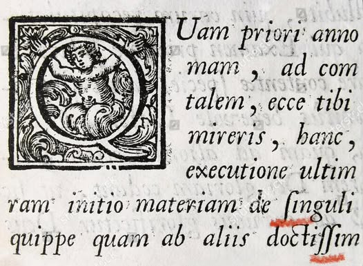
In the shadowy margins of medieval manuscripts and early printed books lies a typographic quirk that has puzzled modern readers for centuries: the mysterious "long s," written as "ſ." At first glance, it's easy to mistake it for an "f"—and many do. But this isn't a case of sloppy printing or linguistic confusion. It's a deliberate stylistic convention, one that shaped the visual rhythm of written language for nearly 600 years.
What Is the Long S?
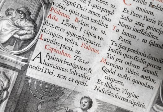
The long s (ſ) is a historical form of the lowercase "s" used primarily in the middle or beginning of words. Unlike the short s (our modern "s"), which was reserved for word endings, the long s resembles a stretched-out version of the letter, often mistaken for an "f" due to its similar shape. Crucially, the long s lacks the crossbar that defines the "f," though in many typefaces, especially older ones, the distinction is subtle.
So when you stumble upon a word like fuſcus in a 17th-century Latin text, don't be alarmed—it's not fufcus, just fuscuswearing historical attire.
A Typographic Tradition
The use of the long s dates back to medieval scribes and was carried into early printing, especially in blackletter and Roman typefaces. It flourished from the 12th century through the 18th, appearing in Latin, German, French, and English texts. Its presence gave manuscripts a certain elegance and flow, guiding the reader's eye through the contours of the page.

In English, the long s began to fall out of favor around the time of the American Revolution. By the early 1800s, it had largely disappeared from printed works, replaced by the short s we know today. Other languages phased it out more gradually, with German retaining it in Fraktur typefaces well into the 20th century.
Why the Confusion?
Modern readers, unfamiliar with the long s, often misread it as an "f." This is especially common in digitized texts or facsimiles of old books. The confusion stems from the visual similarity: both letters feature a tall, narrow stroke, and in some fonts, the long s even appears to have a faint crossbar. But context is key. If the "f" doesn't make sense in the word, it's probably a long s.
This typographic relic has led to humorous misreadings—like interpreting "ſin" as "fin" or "ſucceſs" as "fuccefs." While amusing, these errors highlight how much typography influences comprehension.
A Legacy in Letters
Though obsolete, the long s remains a fascinating artifact of linguistic history. It reminds us that writing is not just about words, but about how those words are shaped, spaced, and styled. Typography evolves, but its quirks—like the long s—leave behind stories etched in ink and type.
So next time you encounter a puzzling "f" in an old text, take a closer look. It might just be a long-lost "s," whispering from the past.